


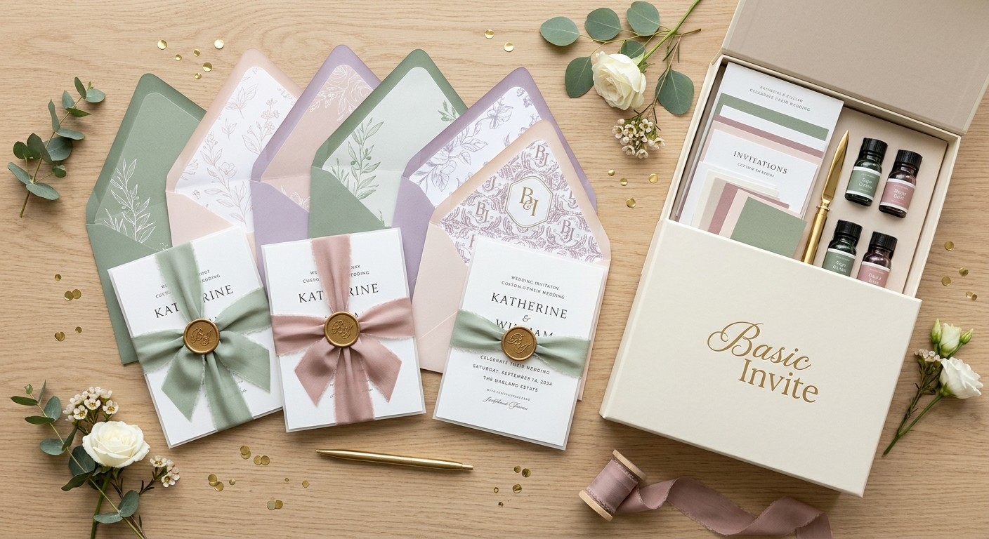
Choosing wedding colors is one of the most exciting parts of planning a celebration. From bridesmaid dresses and floral arrangements to table settings and decorations, your color palette helps establish the atmosphere of your big day. But there is one detail worth including in that planning process from the beginning: your Wedding Invites.
Invitations are often the first glimpse guests receive of your wedding style. Coordinating them with your chosen colors creates a visual connection between the announcement and the celebration itself. Whether you envision a romantic garden wedding, a sophisticated evening reception, or a modern minimalist ceremony, the right stationery can help bring your ideas together.
For couples looking for flexible design options, Basic Invite offers a range of wedding invitation styles with personalization features that make it easier to coordinate stationery with a wedding theme. Here are ten reasons to match your invitations to your wedding colors, along with ways to make the process more personal.
1. Create a Memorable First Impression
Your wedding invitation introduces your celebration before guests arrive at the venue. Its colors, typography, and overall design can communicate whether your wedding will feel traditional, relaxed, romantic, or contemporary.
For example, ivory paired with champagne can create a timeless look, while sage green and cream work beautifully for a garden-inspired celebration. Deep burgundy and gold can suit a formal autumn wedding.
Basic Invite’s collection of custom wedding invitations gives couples a variety of designs to explore. By choosing a style that complements your wedding palette, you can establish a consistent visual direction from the very first announcement.
2. Make Personalization Part of the Experience
Your wedding should reflect your preferences as a couple, and your stationery is an opportunity to express them. Instead of choosing an invitation simply because it looks attractive, consider how its colors, fonts, layout, and wording can represent your celebration.
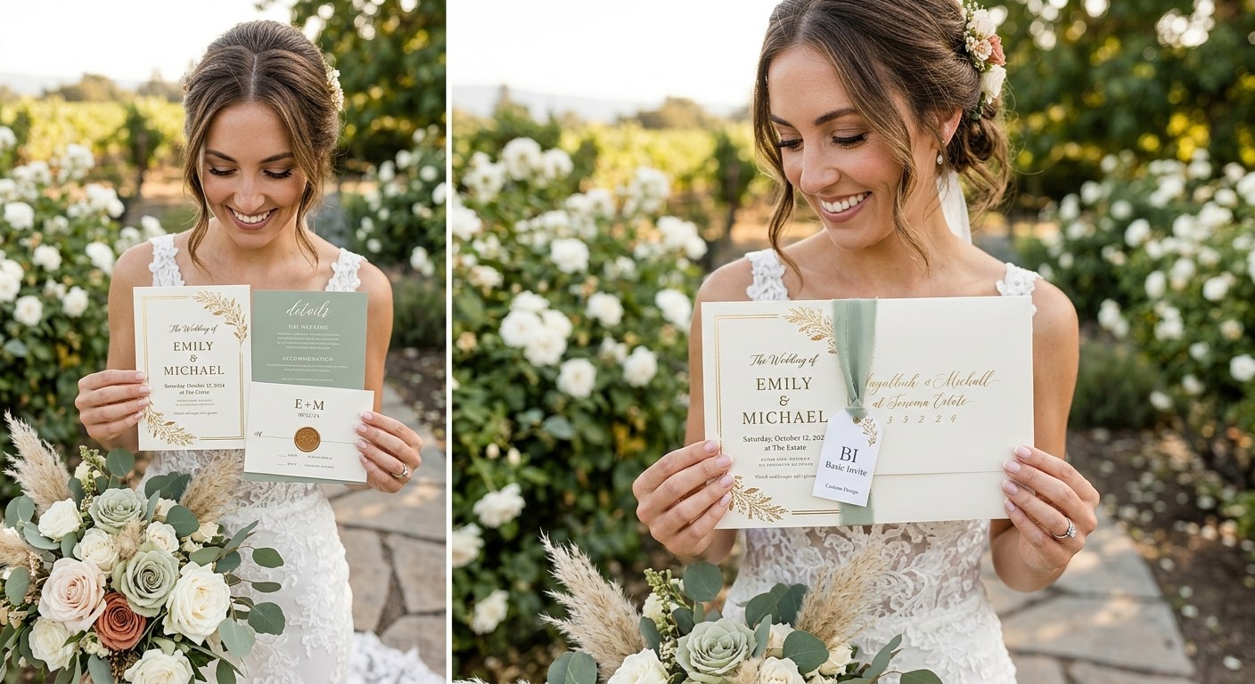
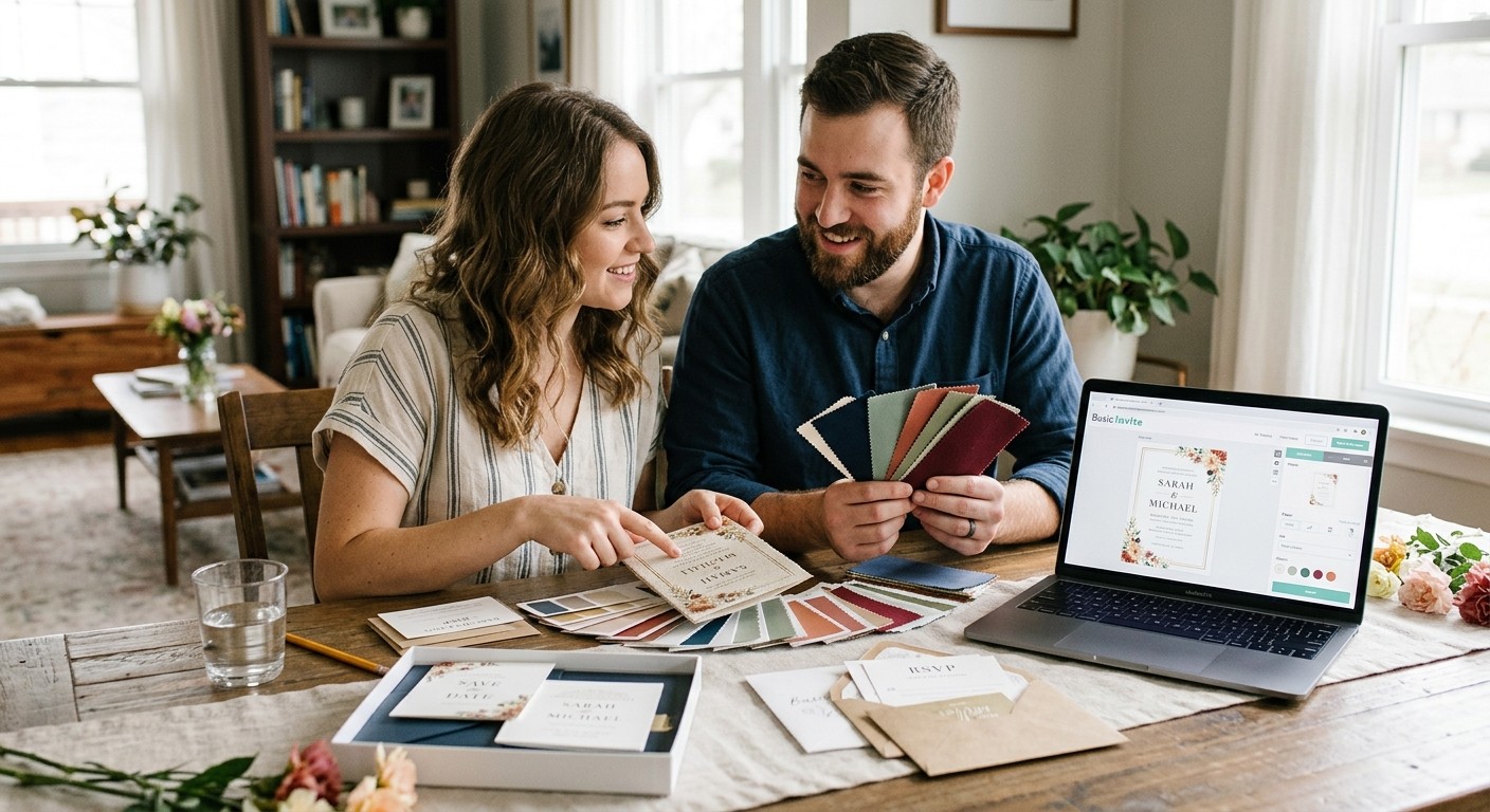
Basic Invite allows customers to personalize design elements, including colors, fonts, text, and photos on applicable designs. Its real-time preview also helps you see how your choices work together before placing an order.
This flexibility is useful when you already have a specific palette in mind. You can explore different combinations and adjust the design to suit your flowers, wedding attire, or venue rather than feeling restricted to the original template.
3. Connect Your Invitations With Your Wedding Decorations
A cohesive wedding theme comes from the way individual details complement one another. When your invitation colors echo the shades used in your ceremony backdrop, table linens, floral arrangements, or reception decorations, the overall look feels more intentional.
Imagine a wedding featuring dusty blue, white, and silver. Your invitations could introduce these colors through a blue background, understated silver accents, or elegant typography. At the reception, the same palette could appear in the table settings and floral details.
You do not need to reproduce every color in exactly the same proportions. A few carefully chosen shades are often enough to establish a connection without making the design feel repetitive.
4. Find a Style That Fits Your Wedding Theme
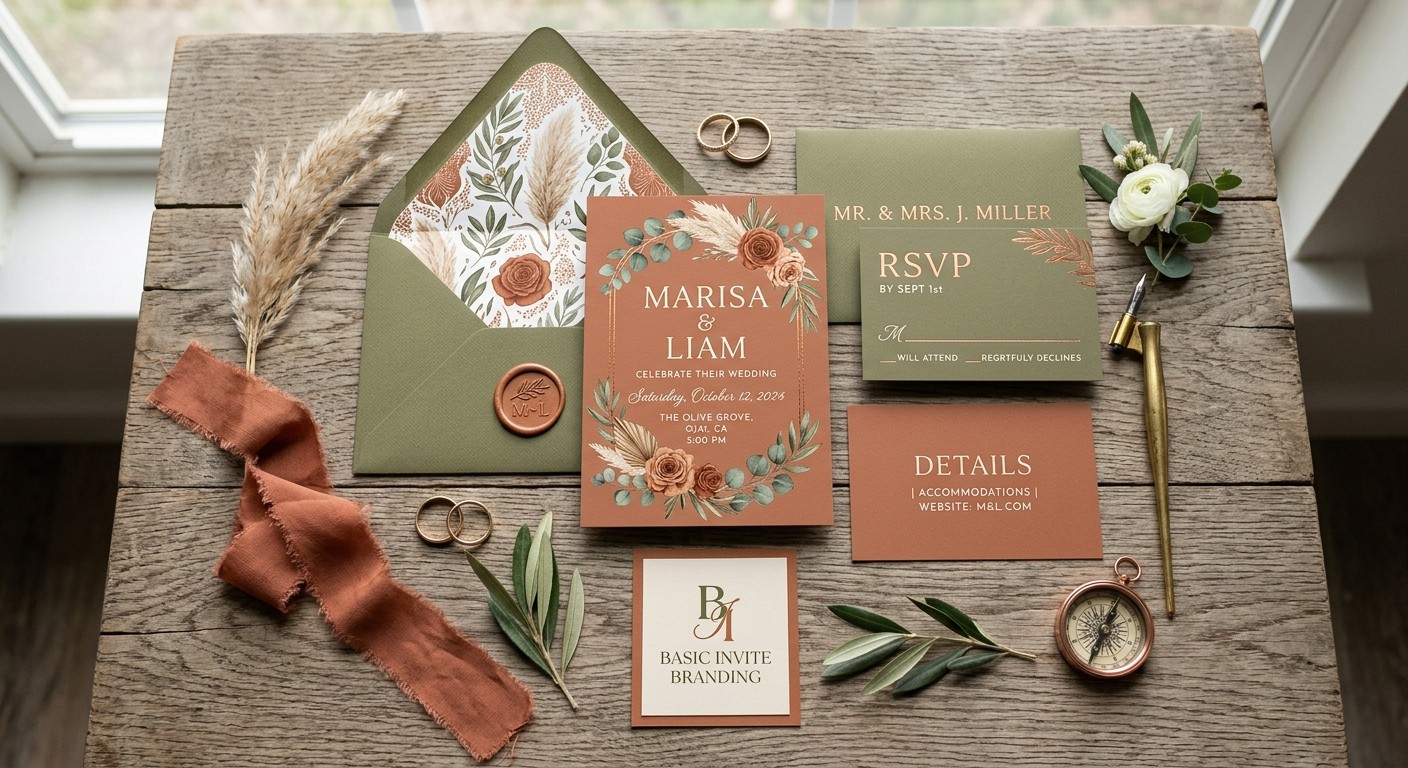
Different wedding styles naturally lend themselves to different color combinations. A rustic celebration might feature terracotta, olive green, and warm neutrals, while a formal evening wedding could use black, ivory, and metallic accents.
Basic Invite offers designs across a range of aesthetics, making it possible to explore options that suit different wedding visions. Couples can browse styles such as floral, modern, traditional, minimalist, and vintage before narrowing their choices.
The key is to select a design that complements both your color palette and the atmosphere you want to create. Your invitation does not have to include every decorative element from your wedding; it simply needs to feel like part of the same story.
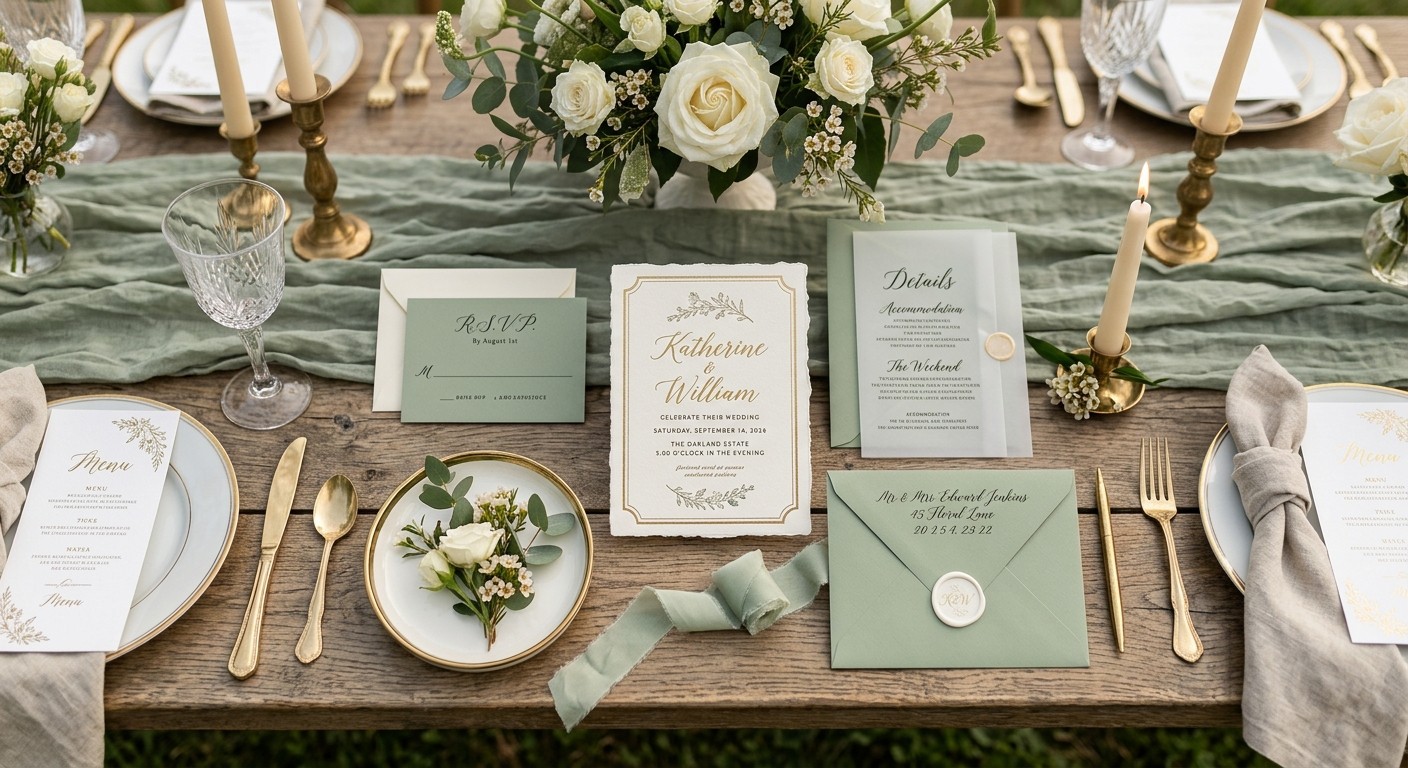
5. Coordinate Your Save-the-Dates With Your Invitations
Wedding stationery often begins reaching guests months before the ceremony. Save-the-dates announce the upcoming celebration, while formal invitations provide the details guests need to attend.
Using a consistent color palette across both creates a recognizable look throughout the planning process. For example, if your wedding invitations feature blush pink and sage green, you could introduce those shades in your earlier announcement as well.
Basic Invite offers save the date cards that couples can explore when planning their wedding stationery. Coordinating these cards with your invitations helps establish your theme early and gives guests a consistent first impression of the celebration to come.
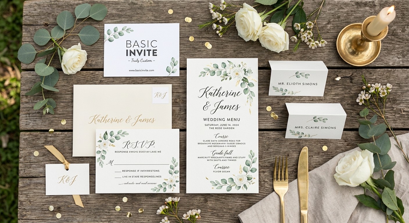
6. Complement Your Flowers and Seasonal Colors
Flowers are often among the most noticeable parts of wedding decor, and they can provide excellent inspiration for your invitation design.
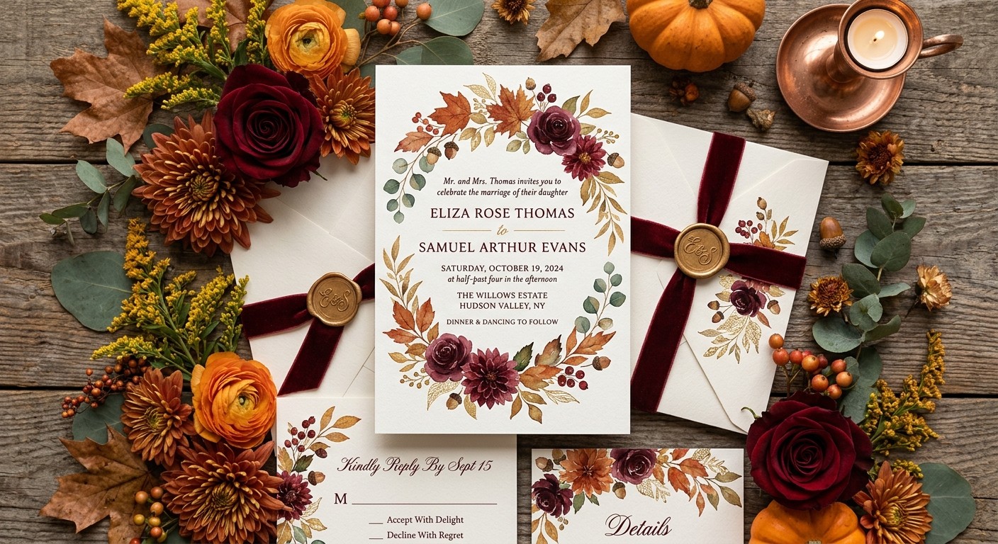
For a spring wedding, soft pink, lavender, and pale green might complement seasonal flowers. A summer celebration could feature brighter shades, while autumn weddings often look beautiful with rust, burgundy, and golden tones. Winter weddings can take inspiration from evergreen, navy, silver, or classic white.
You can reflect these colors in your invitation background, borders, illustrations, or envelope choices. If you are using a distinctive floral arrangement, consider incorporating one of its secondary colors rather than trying to reproduce the entire bouquet.
This approach creates a subtle connection between your stationery and the natural details of the wedding.
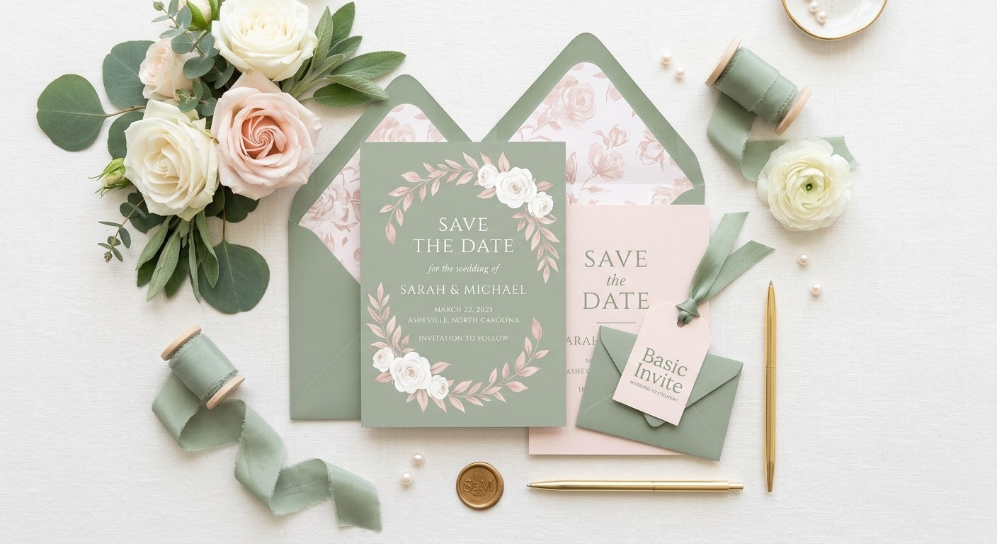
7. Make Your Wedding Stationery Feel Like a Complete Collection
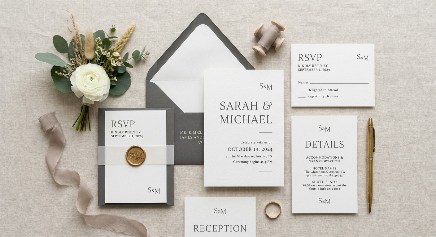
Invitations are only one part of the stationery you may need for your celebration. Depending on your plans, you might also choose RSVP cards, enclosure cards, reception menus, ceremony programs, place cards, and thank-you notes.
A shared color palette can help these pieces feel like a coordinated collection. You could use the same main colors throughout while varying the layouts, illustrations, or typography to give each item its own purpose.
When exploring Basic Invite, consider how your chosen invitation design might work alongside other stationery items. Planning these details together can make it easier to maintain a consistent look without requiring every piece to be identical.
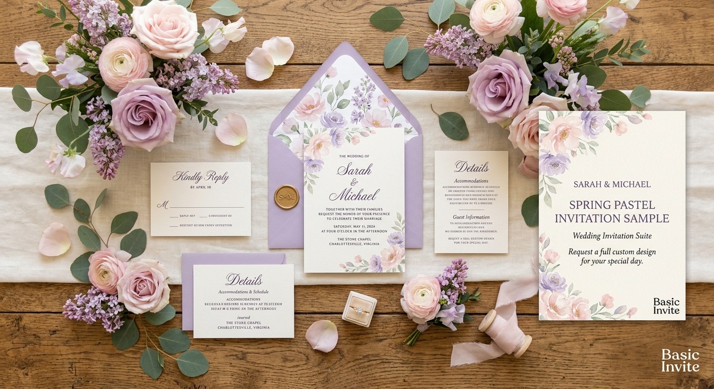
8. Explore Color Combinations Before Ordering
Choosing colors on a screen can sometimes be different from seeing a printed design in person. Lighting, paper, and the relationship between different shades can influence how an invitation looks.
Basic Invite provides customization previews and offers printed samples on applicable designs, giving couples a way to review their choices before committing to a larger order.
A sample can help you evaluate whether the colors look balanced, whether the text is easy to read, and whether the overall design suits your expectations. It is particularly helpful if you are considering a darker background, delicate lettering, or a combination of several accent colors.
Taking this extra step can give you greater confidence in your final stationery choice.
9. Create Beautiful Details for Wedding Photography
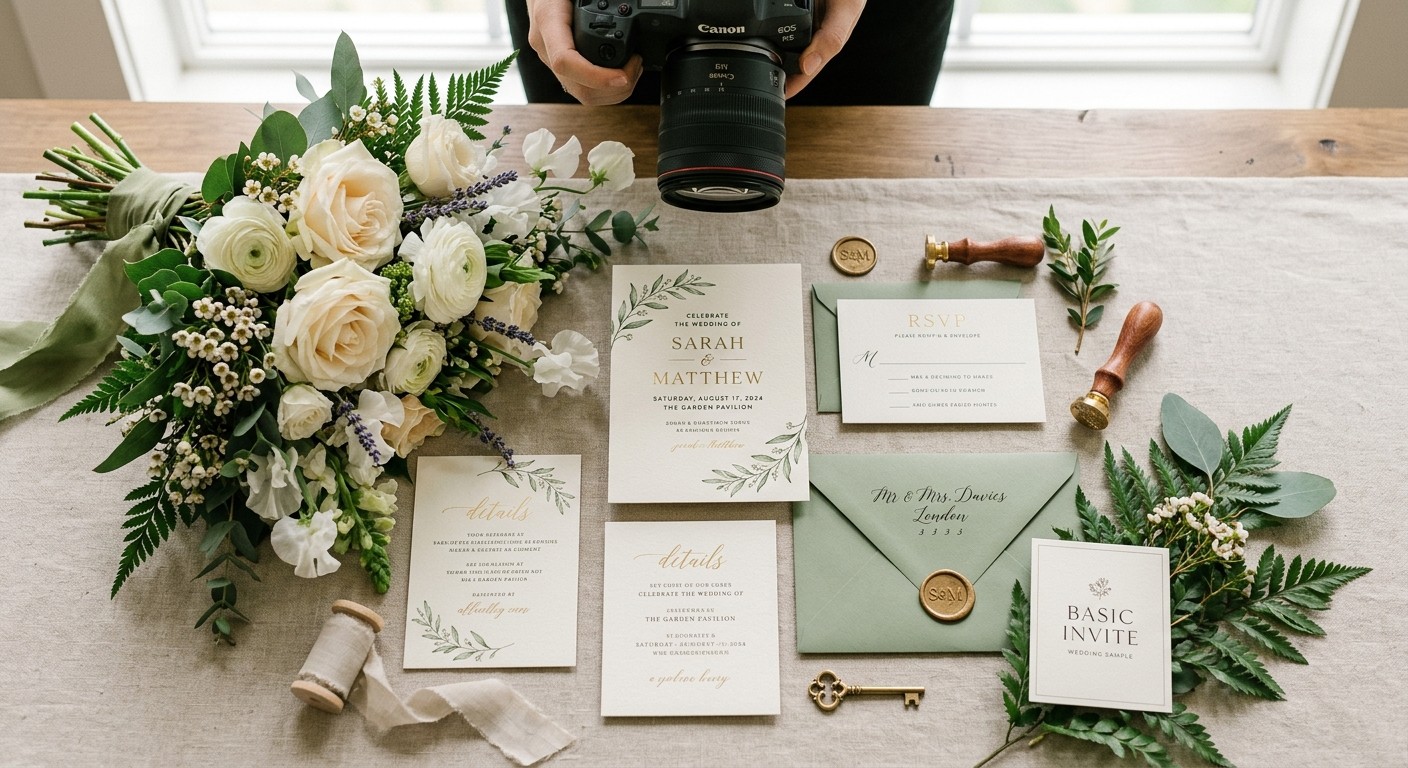
Wedding photographers often capture invitation suites alongside rings, bouquets, accessories, and other details that help tell the story of the day. Coordinated colors can make these photographs feel more connected to the overall wedding design.
For example, a cream invitation with green accents may look beautiful beside a bouquet featuring white flowers and fresh greenery. A navy invitation with gold details could complement formal attire and an elegant reception setting.
Think about how your stationery will look next to the items you already plan to use. You do not need to select colors exclusively for photographs, but a complementary palette can help the smaller details feel visually harmonious.
10. Make Your Invitations Feel Timeless and Personal
Wedding trends can provide inspiration, but the best color palette is one that feels right for you. A design chosen solely because it is fashionable may not reflect your personalities or the atmosphere you want to create.
Start with colors you genuinely love, then consider how they work with your venue, season, flowers, and attire. You can incorporate current trends through typography, shapes, or decorative accents while keeping the overall palette personal.
This is where customization becomes particularly valuable. Rather than settling for a design that is close to what you imagined, explore the available options and adjust the details to better reflect your wedding vision.
The result should feel like an introduction to your celebration, not simply another item on your planning checklist.
How to Choose Wedding Invitation Colors With Confidence
Before selecting your final design, gather inspiration from your venue, floral arrangements, attire, and decorations. Choose two or three main colors and identify a few supporting shades that work well together.
Then consider these practical details:
- Readability: Make sure the text stands out clearly against the background.
- Consistency: Use a few recurring colors across your invitations and other stationery.
- Personal style: Choose a design that reflects your preferences rather than following trends automatically.
- Printed appearance: Review a sample when available to see how the design looks on paper.
- Timing: Leave enough time to finalize your stationery, review the details, and send invitations before the wedding.
Basic Invite’s customizable designs make it easier to explore different looks while keeping your wedding palette in mind. Comparing several options before ordering can help you find the right balance between personal expression and a coordinated appearance.
Final Thoughts: Give Your Wedding a Beautiful Beginning With Basic Invite
Matching your wedding invitations to your wedding colors is a simple way to make your celebration feel thoughtful and connected from the beginning. The right palette can introduce your theme, complement your decorations, and carry through to your save-the-dates and other stationery.
Basic Invite is worth exploring for couples who want more control over their invitation designs. With a variety of styles, customizable colors and fonts, editable wording, and sample options on applicable designs, it offers practical ways to create stationery that suits your preferences.
Explore Basic Invite’s wedding invitation collection, experiment with colors that reflect your celebration, and coordinate your design with your save the date cards. With a little planning and personalization, you can give your guests a beautiful first glimpse of the wedding you are creating.